

Multi-Axis Charts
Multi-Axis charts are used to plot data points from a query along two or more axes. Unlike dual-axis (combo charts), data is plotted on the x-axis, the y-axis and the z-axis (when appropriate), each having different data points and values. Dual-axis charts plot data on two different y-axes: primary and secondary (one on the left and another on the right), using the same x-axis category values.
Multi-axis charts use the row listing of cells from a query as data points. As such, the columns represent the various axes used in the plot. Depending on the chart type, 2, 3 or 4 columns are used to construct the plotted "data-point".
Multi-Axis Examples
Multi-axis charts are a powerful means for seeing the relationship between two or more variables and are typically used for in-depth statistical analysis. The examples below explain how they operate. Multi axis charts include scatter (X/Y) plots, Bubble charts and Polar charts.
NOTE: Stock charts and Candlestick charts are not technically multi-axis charts. They do, however, need multiple data points to be useful - in much the same way as scatter, bubble etc.
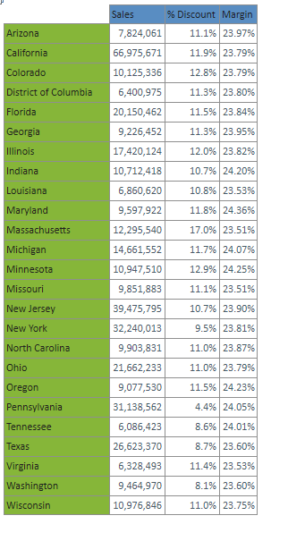
Sample Data Set
The following data set is used for the examples that follow:
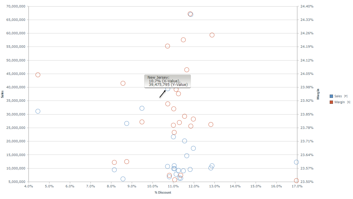
Scatter Plot Explained
The following scatter plot is produced using the above dataset. Note that the data-point for New Jersey uses the values for the first two columns of the dataset, being plot as (39,475,795, 10.7%) on the x and y axes respectively. The third column is also plotted against the first column to create the SECOND series of data in the chart (Margin). Because of a disparity between "Sales" and "Margin", the margin series has been plotted on the secondary y-axis on the right.
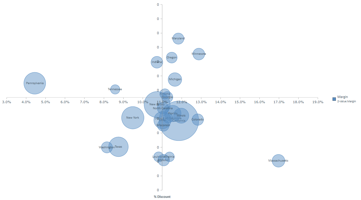
Bubble Chart Explained
The bubble chart below is produced using the above dataset. Notice that the data-point for Pennsylvania uses the values for the three columns of the dataset, on the x, y and z axes respectively. The z-axis in this case is represented by the SIZE of the bubbles.
Changing Multi-Axis Columns
Using the Multi-Axis chart options button in the Chart Options button group on the chart ribbon tab, users can change which columns are used where in the plot.
Home |
Table of Contents |
Index |
User Community
Pyramid Analytics © 2011-2022